You might therefore think that NPS 160 would be a minor cosmetic update to NSP 160, not much more than the new packaging with very neutral silver and black besides familiar green and a new deep maroon. In fact, it is a totally new film which behaves differently and has characteristics so far superior to the existing emulsion that only Reala, in the past, has made a similar jump.
NPS 160 has grain which starts one-third of the size of NSP 160, though during processing some of this advantage is lost. The final negative is subjectively half as grainy as NSP, giving it a very smooth appearance when enlarged.
NPS 160 has much greater latitude, as is clear from our test negatives taken on one roll without any metering, just guessing. All frames were fully usable even when two or stops out either way. Correctly exposed negatives are perfectly graded and have a controlled contrast which is not in the slightest flat, yet manages to avoid any hint of harshness.
The seasoned NSP user will be asking about the highlights, with specific reference to natural and brightened whites such as wedding dresses. NSP has a familiar failing in that when skin tones are at their best, whites may be very slightly blue. The Fuji skin tone is a pinker shade than KodakÕs standard, rendering non-European skin colours more sympathetically. The temptation when printing NSP has been to correct the blue out of whites and highlights and the pink out of skin tones, resulting in an overall shift which destroys neutral greys and makes foliage spring green at any time of year.
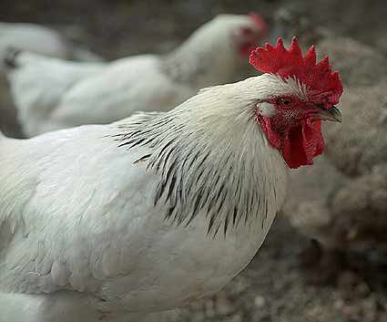
NPS ends this for good. The highlight end is free from any hint of blue, and will record subtle cream and off-whites accurately (see our resident cockeral Jarvis, above, with one of his consorts down below the office window). The skin tones, while remaining traditional Fuji, have less tendency to go too red. There is a greater range of greens on offer, due to new characteristics in the yellow layer, ending the tendency for all Fuji greens to be the same green.
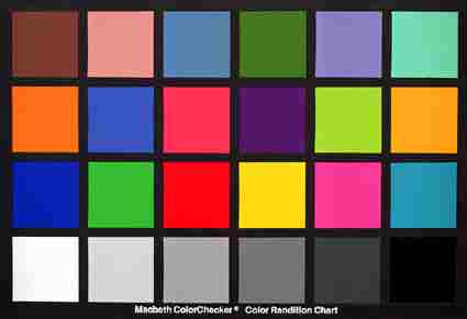
This colour discrimination is generally enhanced across the spectrum, including some shades of blue and violet which we can not accurately reproduce in print. Labs will find the slightly heavier density of mask and image call for longer exposures, but the filtration is a less critical once established.
All in all, NPS 160 is a major advance for general professional photography - a much better all-round emulsion for the photographer obliged to tackle commercial, studio, wedding, portrait, industrial and PR work on successive rolls. Its remarkable sharpness and almost invisible grain make it superior to existing 100-speed films while its control of contrast, latitude and high level of colour discrimination ensure that the film can master the situation rather than vice-versa.
NPS 160 also scans well, for commercial printed work, and our scans here are direct from negatives on the Leafscan 45. The Macbeth color checker is compressed to the maximum using JPEG, because all that matters is the color, not the detail, in this case!
Fujicolor NPS 160 is available now in rollfilm - look for the distinctive
new elements of silver and black on the pro-pack box - and shortly in 35mm.
DK