
Use a smaller tripod? No!
Take out some of the junk that we all accumulate but never use? Perhaps - but what about the one time that we may need it? I'd better leave it in!
Carry one camera, accessories and only color negative film, then make both color and monochrome prints from that film stock? Possible, but for a purist monochrome worker this sounds like sacrilege.
Nevertheless, the last option set me thinking about making monochrome prints from color negatives; after all, pressmen regularly do so. While I was at it, why not also print black and white negatives using color print paper?
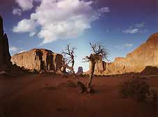
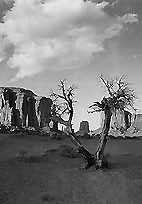
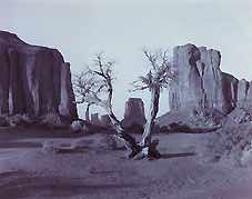
I chose two negs made on a recent trip to Monument Valley in Arizona - one color, one mono.
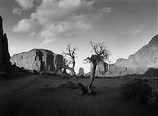
Using grade 3 dial-in filtration on Agfa Premium RC variable contrast paper, I made a monochrome print but found it to be lacking in contrast. A second print on grade 4 produced the required range of contrast, although the sky was printed in using grade 1. The finished print, below, is remarkably good, showing no trace of grain, and is similar to about grade 2.5 to 3 on black and white paper.
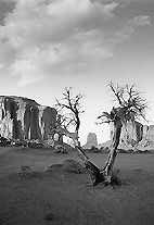
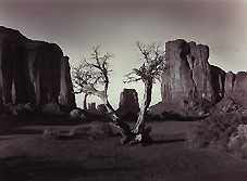
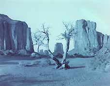
Kodak offers Panalure Select paper for more tonally correct, contrast graded monochrome prints off color negs. You must use color safelighting or work in the dark! Panalure is a panchromatic, resin coated paper available in soft, medium and hard grades. I chose the hard grade for the first print, but found it to be too contrasty... while the medium grade is slightly softer than I would wish. The prints shown below, from left to right, are a soft-graded print on Agfa Multicontrast Premium, the medium (2) grade Panalure Select, and the hard (3) Panalure.
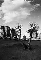
By using techniques such as two-bath development and flashing with the panchromatic Panalure Select, the harder grade could be softened to a more acceptable contrast range. Again, the Panalure prints are good and show no sign of grain although a print similar in contrast to the one made on Premium would require a little more work to produce. The quality of both prints is a good testament for the Fujicolor film stock and both papers, but it's clear that you do not have to buy hard-to-use panchromatic bw paper just to make a decent print from a typical landscape color negative. Multi-graded paper will do fine with care.
I did not explore the most interesting aspect of Panalure, which we will look at in a future issue. Because it is panchromatic, you can use dial-in enlarger head filtration to 'filter' your original negative just as you would treat a black and white shot. You can imitate the effect of a 2x yellow, 4x orange or 8x red filter but shoot all your landscapes unfiltered on color negative stock.
Having looked at printing color negs on mono paper, I then looked at using a color set-up to print from a similar black and white neg.
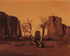
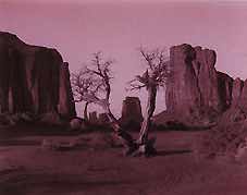
Then, with a guesswork starter pack of 30 yellow and 30 magenta dialled into the enlarger, I exposed the black and white negative only on to Fujicolor EP2 paper and developed it in Agfa chemicals. The result was an orange/yellow print (below), clear evidence of the lack of the orange mask layer of color neg films.
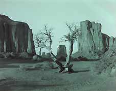
Using the same filtration, chemicals and paper but with a piece of unexposed, developed color film sandwiched to the black and white negative produced a green print (below).
I then tried various combinations of filtration and produced a number of colors from greenish grey to copper red. Again the quality was surprisingly good although the print made without the color film had much less grain.
Here's an example at 10M + 30Y + film base, a cool-black, nearly neutral tone.
This one gives a tone very similar to controlled blue toning of a mono original. The filtration was 30M + 50Y + film base.
Similar to a red toner, this filtration also made the image look much more grainy (which is interesting because red toners do the same thing to mono prints). Settings: 20Y + 10C + film base.
With care, a totally neutral grey image could be produced. I preferred the subtle tints, resembling partial toning, produced by some of the tests. You could get almost any color of print you wanted by changing the filtration, but you can't get that rich, dark grade 4 mono look. All the prints on color paper are much softer.
Making monochrome prints from color negatives has got some merit, in that it can provide you with a very good image that you may not have a black and white negative for. I found that the best results were obtained when using the harder grades of either variable contrast or graded papers, but I would not bother with the considerably higher cost of Panalure Select with its total blackout working conditions.
I would not suggest that we can stop using black and white negative stock but there are times when, for a number of reasons, we capture an image only on color film and realise later that we wish to have a monochrome print. Do as I did, print your color negative on to black and white paper, and you may well get the same satisfaction as I did.
When we have re-stocked with Panalure Select, I will look at the kind of filtration values needed to produce those rich Ansel Adams skies from an unfiltered color shot - if indeed the same effect can be achieved by this route.