
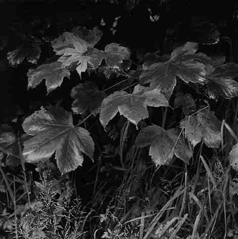
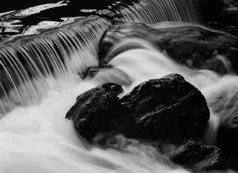
Kentmere Finegrain VC
Kentmere, the Cumbrian paper manufacturer, has added another paper to an
already comprehensive range. Finegrain VC is described as a double-weight
fibre based variable contrast paper with a fine stipple surface and an image
tone which is claimed to be neutral on a clean white paper base.
I last tested Kentmere paper in October 1994 and had some reservations as
to its ability to compete with the recognised quality fine art papers, although
I did feel that Kentmere were beginning to approach that standard. My anticipation
now was in the hope that a British manufacturer may have a product that
could match the best in the world of fine art papers.
THE TESTS
All prints were made using Kentmere Select Plus Developer and Fixer and
my usual stop bath. The developer was used at normal 1 to 9 dilution and
development times of 2 and 3 minutes were used. A reduced development time
of 2 minutes was used to assess if any colour change occurred (see further
comments later in this article). I tested for safelight compatibility by
exposing a sheet of pre-flashed Finegrain VC for 10 minutes to an A10 Encapsulite
safelight and found no trace of any fogging. The maximum black of Finegrain
VC was measured as 1.43, but this is very misleading and entirely due to
the grained surface p; it looks like density 2.0 visually.
The paper is well packaged in the distinctive blue and white Kentmere box.
When a sheet is removed from the internal black plastic bag it has a pronounced
curl to the emulsion side. This did cause some problems when placing the
paper into the masking frame for it did not lie flat and had a tendency
to move as the easel was closed. I had to hold the paper down with one finger
to put it is my easel, and this is not an ideal way to handle unexposed
paper as you run the risk of getting marks on the final print should your
finger be damp or 'greasy' when holding it in place. I cannot see this being
the normal condition of the paper but I will speak to Kentmere and let them
know of this problem.
CONTRAST CONTROL
The contrast is controlled by using dial in filtration factors that are
supplied on the instruction leaflet. Two comprehensive tables are given,
one which gives single value factors of magenta or yellow, and a second
which gives combined filter settings to obtain speed matching of grades
0 to 4. Grades 00 and 5 require extra exposure. Both tables give values
for enlargers with Durst, Kodak or Agfa filtration. Kentmere recommend that
either Ilford Multigrade or Kodak Polycontrast below the lens filters as
well as modular enlarger heads can be used for contrast control. I tested
the paper using dial in filtration on an LPL 7450 colour enlarger and both
Ilford and Kodak below the lens filter sets.
Contrast across the range of grades generally look similar to Ilford Multigrade
IV. However, as my Multigrade IV is glossy and Finegrain VC is almost matt
when dry, this is perhaps an unfair comparison as glossy prints generally
appear to be higher in contrast than other surfaces. Close examination shows
that the whites of Finegrain VC are slightly brighter than Multigrade IV
but the blacks appear to be not quite so rich.
Again, the reason is the paper surface in that a black produced by a matt
paper is always slightly less rich in appearance than the black of a glossy
paper. The paper base of Finegrain VC is slightly whiter than Multigrade
IV which would account for the brighter white. The final print made using
Kentmere's dial in filtration values gave detail throughout with excellent
highlight values and rich blacks which held detail in the deep shadows and
the print glows because of this.
The prints made using both Kodak and Ilford below the lens filtration were
less than satisfactory in that the Kodak filtration produced a result that
was nearly one grade softer than the original reference print made using
Kentmere's recommended dial in filtration. The print made using Ilford filters
gave similar highlight and shadow tonal range to the reference print but
the mid tones were significantly softer and lacking in brightness. I used
the current filter packs that are available but there must be many photographers
who are using the older sets which could introduce yet another variable
into the equation. These results did not surprise me as I have always felt
that manufacturers' below the lens filters could not be universal. A simple
comparison of the recommended dial in filtration given by all manufacturers
for their own product show significant differences in the values required
to achieve the same grade. Therefore, how can below the lens filters be
universal.
I appreciate that producing below the lens filters costs money, but surely
if a paper manufacturer takes the trouble to produce an emulsion that is
unique, they should give the end user the necessary means to get the best
out of that paper? I rest my case.
THE FINAL PRINT
Kentmere describe the print colour as neutral but I found it to be slightly
on the warm side which, in my view, is not a bad thing. When developed for
2 minutes the print colour was noticeably warmer and I would think that
Finegrain VC would respond well to the various manipulations that bring
about a colour change. Finegrain VC handled satisfactorily in the solutions
and dried reasonably flat when air dried on a drying rack, although most
other fibre papers have less curl when air dried. I recall that in my previous
test of Kentmere paper that I was slightly critical of the drying characteristics
of the paper and I have to report that it has not changed very much. It
is not a major problem to flatten prints by placing them into a flat bed
mounting press in between two pieces of museum board for 1 minute at a medium
temperature. My tests show a drydown factor of 10% for Finegrain VC.
TONING
All prints made in my darkroom are toned in either selenium or gold and
sometimes both. Finegrain VC tones well in selenium diluted 1 to 6 with
the lower values taking on the richness that is a feature of selenium toning.
The general colour of the print changed from being slightly warm to a rich
slightly plummy tone. When toned in gold Finegrain VC cools down considerably
with the highlights taking on the characteristic blue of gold prints. I
also toned a print in both gold and selenium which gave an almost 3D effect
in that it increased the depth throughout the print by giving the highlights
a glow that is not evident in the untoned print. The gold toning gave sparkle
to the highlights and the selenium increased the depth of the lower values
and the overall contrast was increased. The print was also noticeably cooler.
Finegrain VC is a paper that responds very well to toning and clearly, many
other changes can be achieved by experimenting with time and dilution.
CONCLUSION
Kentmere Finegrain VC is a paper that produces a full range of tones from
luminous blacks to delicate highlights and is, in my view, a great improvement
on the last Kentmere paper that I tested. I feel that perhaps it is the
first Kentmere paper that can compete at the highest level in fine quality
photographic papers. There are some small grumbles such as the distinct
curl when the paper is removed from the box, and the slight problem when
the print is air dried but they can not detract from what is a fine paper.
With a product of this quality I do think that Kentmere should address the
more serious problem of filtration. For those photographers who use a colour
head there will be no problem in getting the very best out of Finegrain
VC, but where below the lens filtration is used the results could be significantly
different, especially if Kodak filters are used. However, let us not dwell
too long on such problems but let us take heart in the knowledge that Kentmere
have given us a paper, manufactured in the picturesque surroundings of the
Lake District, that is a valuable addition to the range of high quality
papers that are available to us. I look forward to the next development
from Kentmere, for in my view they have come of age with the introduction
of Finegrain VC.
Les McLean
Return to Photon June 96 Contents