
It is true that Polaroid makes two instant b&w slide films and that Kodak offers a reversal kit (Direct Positive Film Developing Outfit) for T-Max 100, but none of these options is a true alternative to Agfa's Scala 200. The instant films (normal contrast Polapan, rated at ISO 125, and high contrast Polagraph, rated at ISO 400) are available in 35mm only. They also work out rather expensive on a pence per frame basis, but do have the huge advantage of speedy and easy daylight processing. Kodak's T-Max reversal kit is none of these things, and requires the film to be down-rated for best results. On the other hand, it is for all formats and can be used on everything from 35mm rolls to 8 x 10" sheets.
Scala 200, on the other hand, is available in both 35mm and 120 and can be processed by a lab (Joe's Basement in the UK, others in different countries) in just two hours. In addition to these routine-use differences, Scala 200 is more versatile all round, especially when it comes to tailoring the film to suit particular situations.
Users of b&w negative films are accustomed to being able to fine-tune contrast at the printing stage, but this is not possible when shooting on slide film. Similarly, b&w negative films can be adjusted for exposure and processing to record just the right amount of tonal information (using the Zone System, for example) - another technique that is not normally available to slide film users. Scala 200 breaks through both these limitations and should therefore, in theory at least, provide the very best quality transparency images possible.
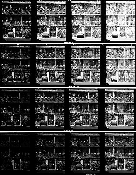
The only obstacle that stands in the way of turning theory into practice is the fact that Scala requires disciplined handling: it is a b&w film for slide-film users, not a slide film for b&w-film users. In short, photographers who rely on the darkroom to correct their camera mistakes will come unstuck with Scala. Chances are that the film will get the blame when the real problem lies elsewhere. To get the best from Scala 200, the film's contrast characteristics need to be explored. The image grid shown here is a guide to that behaviour.
Four films were given an identical series of exposures, from two stops under to one stop over the normal ISO 200 exposure, then given four different processing routines, from two stops of push processing to one stop of pull. Effectively, this gives the correct exposure and processing conditions for assumed film speeds of 800, 400, 200 and 100 - shown on the grid by the diagonal line of images running from the top left corner to the bottom right. (For the record, the exposures given were based on the mid-point of spot readings taken from the brightest stone gate-pillar and the shadow under the car's rear bumper. The brightness range was eight stops. Exposure adjustments were made altering the shutter speed alone.)
Contrast clearly increases with under-exposed and push processing, and decreases in the opposite case. Roughly speaking, the extent of the change is equivalent to one stop of brightness recording range with each stop of speed change. The normally rated and processed film (second row up) is actually slightly too high in contrast for the scene shown, only being able to hold about seven stops of subject brightness. Down-rating the film to 100 and pull processing one stop gives a good eight stop range (bottom row), while rating at 400 and pushing one stop cuts the brightness recording range to about six stops (second row down).
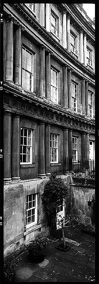
The importance of this behaviour in practical terms is illustrated by the 617-format building exterior shown here. This was shot in very dull weather, with the spot meter showing only five and a half stops of subject brightness range. The film was therefore uprated, with the intention of using push processing to boost the contrast. In this case, the film was shot at EI 640 and pushed 1.5 stops in processing. The result is a pleasingly bright transparency that belies the prevailing weather conditions.
While this is an example of technical correction, the same contrast changes might find use in creative photography too, creating a soot-and-whitewash effect perhaps? Nice though this idea is, I have not been able to get it to work. The trouble is that Scala 200's contrast flexibility is too limited to produce stark results from any but the highest contrast scenes. So while the film can be used to enhance what was seen before the camera, it cannot transform a scene in the same way that slow b&w negatives can when printed on Grade 5 paper.
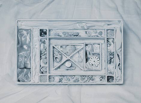
An area where Scala does have the creative edge, however, is toning. There is nothing new about the idea of toning b&w films: it has long been done with selenium as a means of improving archival permanence and has also been done with other toners as a means of creating false colour negatives that are then printed onto colour C-type paper to produce eye-catching results. With Scala, the whole process is much simpler since the toned film is the finished image.
As is the case with print toning, the starting image needs to be of the right density and contrast for the toner being used: sepia tends to bleach and soften, while blue and copper tend to intensify. Uniquely though, one of the major problems of print toning, that of paper staining, is absent in film toning. This ought to be a good thing, but isn't always. The catch is that large, clear, colourless highlights look terrible when slides are viewed by transmission - on a light-box, for example. To avoid this failing, Scala 200 frames for toning should either be slightly darker than usual, or have highlights that are meant to be true highlights, not just areas that are lighter than others. This last point is difficult to appreciate in isolation but might become more obvious by studying the toned examples here.
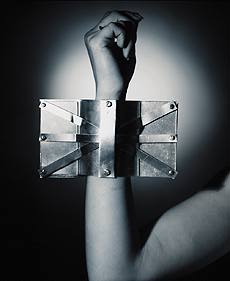
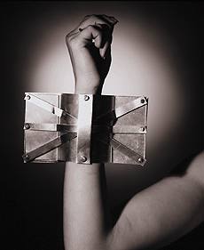
Blue and copper toned versions of the same image, shot and processed as normal. The blue version toned significantly faster than the copper, and shows slightly more highlight burn-out. Both toners were Fotospeed chemistries, used exactly according to the manufacturer's instructions. All photographs by Jon Tarrant. Arm-band and box designed by Anouska Fowler.
High-key image, blue-toned using Fotospeed chemistry. The original pictures were bracketed in half stop increments on a film given normal processing. Trial and error was used to find the exposure and toning combination that gave the best result.
In the arm-band picture, the highlight is a projected light on the background: it is clearly meant to be a highlight and not just a light area. In the high key shot - probably the most difficult technique to get to work on transparency film - the entire feel of the image is one of lightness. Even so, the original slide does look a bit odd, though by the time it is on the screen it ought to give the right impression.
The mechanics of toning Scala frames are much the same as they are for print toning. Off the shelf toners, tried here as Fotospeed's blue and copper offerings, work perfectly well. Solutions are made up at the normal strengths, though in much smaller quantities. Single frames of film are easiest handled by sticking adhesive tape (Sellotape) along one rebate. Toning generally seems to involve a slow start, speeding-up once the process gets started, and a significant run-on before the solution is fully washed out by the subsequent water bath. Apart from that, it's a matter of experimenting to see what happens with the usual range of toners and toning/split-toning techniques.
In next month's column I will be continuing the toning theme with a look at the Colorvir system, including examples of both print and Scala 200 images.
E-mail the author Jon Tarrant
Return to July contents