
We know we are not alone in finding that well-calibrated monitors set to a moderate gamma - 1.4 or 1.8 depending on the type of monitor and its tendency to 'crush' black detail - combined with sensible scanning and PrePrint output can be an efficient and consistent route to good printed color.
Adobe/Aldus have, however, chosen to discontinue the simple and effective solution offered by PrePrint 1.6 (the last version) and provide no upgrade path to the extremely expensive and needlessly complex PrePrint Pro, which is not the same product. I suspect the reason for this is that the original PrePrint is a fully OPI-compliant separation utility which, in the right hands and with good network management, makes such current products as Adobe's recently-acquired ColorCentral an unlikely purchase for the smaller bureau or publisher using PageMaker. PrePrint will, in fact, do 90 per cent of the work of ColorCentral despite costing only 10 per cent of the price - if that, as most PrePrint copies were issued free with the upgrade from PM3.5 to 4.0.
PrePrint will not be supported in future, even though the instructions packed with PageMaker mention it is if it was the recommended companion. It requires an FPU, and thus will not run on Power Macs under emulation unless Software FPU is installed. Nor will it run on many later 68040 Performa, Centris or Quadra models without the same software solution. It is most at home on something like a Quadra 950, as its on-the-fly streaming of CMYK data from RGB files is processor intensive. A fast Mac can speed up PrePrint's printing times enormously.
Faced with the prospect of forever running our two PrePrint copies on older Macs or clobbering our fast Power Mac with Software FPU (not so bad, in fact, as we have now learned) I decided to use the alternative method for color separating in PageMaker - do the CMYK conversion in Photoshop 3.0, import CMYK TIFFs or EPS files, and print directly from PM5.0.
We have encountered awful problems. Here is an example of an image as it should look, from the July Photon printed (and WWW) edition:
Here is the actual appearance of this file, when saved to CMYK using Euroscale inks at the default dot gain and densities, GCR with Light black generation, and 300% ink limit. The Monitor Set-Up, which we will find is critical to the way Photoshop creates CMYK, was a dead neutral one - Hitachi EBU phosphors, Gamma 1.8, 6500K, and Medium lighting. The actual set-up of the monitor, confirmed using both the Gamma CDEV and a SuperMatch Calibrator as well as visual experience, matched this precisely. So why did we get this on the printed page?

PageMaker and Photoshop between conspire to print this file pretty much as it appears if you open the CMYK file in an application which does not simulate accurate RGB displays. Photoshop displays the file normally in RGB, hiding the seriously wrong CMYK densities.
As a result of Shirley's work being ruined, Jon Tarrant's work being ruined, and a feature by Chris Wordsworth only just surviving the repro process, I spent over three days scouring CompuServe and the Net for solutions, and studying Photoshop performance. I found three solutions at least which in their text files stated that Photoshop's CIELab implementation, used in every conversion, is flawed, but mainly these solutions dealt with the problems of Photo-CD conversion to CMYK, which is exacerbated by the poor quality of the Kodak CMS import to Photoshop.
One solution was Adobe's own - a technical note describing how to grab the RGB to CMYK conversion algorithms from other programs, notably Cachet and Color Studio. To run both these, which I have, I needed to install Software FPU after downloading this registerable shareware package. It worked perfectly and also enabled me to run PrePrint on my own machine again.
However, studying the CMYK levels from all three packages, compared to Photoshop, left me deeply confused. The same RGB file created such utterly different sets of CMYK values, despite the fact that both EfiColor Cachet and ColorStudio recommended similar Gamma 1.8 monitor set-ups to Adobe's own instructions in their technical note.
One thing I did know; PrePrint separations, produced on a fully calibrated system and carefully printed, yield a print which is so close to the RGB file viewed on a monitor set up this way that it's uncanny. Not only that, but the original color print or tranny will look visually very close to both (assuming the scanner is set to a repro gamma, usually between 1.2 and 1.5 depending on the make). So I could assume that PrePrint CMYK values were pretty close to an industry standard target.
Photoshop, in general, produced far too much density and contrast. Ink levels reach high limits even in the mid-tones. EfiColor produced lower overall densities but seemed to pull everything towards a neutral, lowering the chroma and generally flattening things off. As the Cachet manual shows a set of pictures I would personally consider to be rubbish if presented as proofs - flat, displaying casts and coarsely screened - this does not surprise me. My standards involve getting a printed page to look as much like a good photographic print as possible.
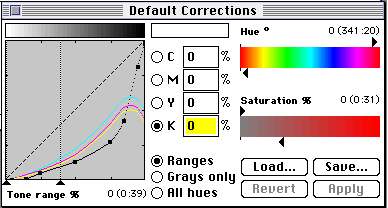
PrePrint's RGB to CMYK algorithms (above) could not, however, be used in Photoshop. The curves go back on themselves - CMY ink densities can actually rise then fall as black takes over, when GCR is used, while in Photoshop all they can do is flatten off or form a straightline UCA plateau. Because Photoshop has to attempt to use CMYK to simulate printed results on an RGB display, it has an artifically limited range of controls to its CMYK conversions. I was able to create Photoshop separation tables based on PrePrint, but the actual type of setting I use personally resulted in strange false-color screen displays, despite the checked integrity of the CMYK file if converted.
Anyway, here are some examples, from a file I was working on for another publisher's book cover - sorry about the copyright infringement, but this is in the public interest, not an example of me pirating a photo. Here is the original RGB file, seen against Photoshop grey:

Now take a look at how Photoshop displays CMYK simulations for Euroscale inks (similar to SWOP), using Printing Inks for RGB-CMYK (default) and Separation Setup for CMYK-RGB. The left hand image shows what you see if you set your monitor gamma in Photoshop Prefs to a ridiculous figure of 0.75 (which no gamma utility will allow you to use!). The right hand image shows the result with the Prefs set to Gamma 3.0, equally extreme in the contrasty and dark direction. The monitor remained firmly at a true gamma of 1.8 throughout, of course:


An orange-brown on the parrakeet with an RGB value of 212,106,30 - which gives a pleasant printing density of 1,47,85,0 CMYK in PrePrint - yielded 3,75,94,0 from Photoshop with everything lined up at 1.8. At the 0.75 monitor setting, these values changed to 5,29,65,2 and at the 3.0 setting to 1,78,98,19. Switching Photoshop to use EfiColor separation algorithms, the result at G1.8 was 2,60,93,9.
Equally surprising shifts resulted if the Monitor Set-Up in Preferences was changed in color temperature. At 9300K instead of 6500, the figures became 12,35,69,1 - at 5000K, they were 0,39,63,0. If I told Photoshop I had a Trinitron monitor, not a Hitachi, it changed them to 4,75,93,0 and if I pretended to have an Ikegami tube they shifted to 8,73,92,1.
These differences may be subtle but the emphasize the volatile nature of Photoshop's conversions to CMYK when, as the two images above clearly show, a massive change in monitor gamma on the Prefs does not produce a huge visual change in the CMYK simulation. Remember, I did not actually alter the monitor gamma, and screen shots actually ignore such actions if I had done.
We move, then, to using the EfiColor Separation Setup tables for CMYK to RGB and vice-versa. Here, Photoshop was told to use the set-up for conversions, not the Printing Inks. There was a massive difference in effect. The left hand image is the G0.7 prefs result, the right hand the G3.0 result:


This difference does more what it is intended to - persuades the user whose monitor is set up so seriously off-average to adjust the original file, using CMYK preview, until it looks normal. But what you may not be aware of is that these prefs settings, unlike the ambient light (Low, High or Medium) have no effect on RGB display. Most serious publishing users work in RGB for as long as possible; it is the native color space of the monitor and scanner alike, contains most data, and gives less data loss when manipulating, resampling and retouching images.
If you don't believe me that staying in RGB is good, ask Kai Krause. He knows. And you'll believe him.
My findings are that Photoshop 3.0 gives far too great a range of variation as a result of Monitor Set-up and Separation Set-Up preference set by the user, which may or may not coincide exactly with true conditions. The variations given are not consistent with the effects of the preferences settings; the weight of ink is generally rather too heavy; black ink levels, bearing in mind that 'light' generation of black was specified, were very high in shadow areas checked out.
Photoshop gives results closest to PrePrint when the Prefs are set to Gamma 1.4, not 1.8 as the manuals and Adobe Tech Notes suggest. Setting to 1.8 generates heavier CMYK on the assumption that the user has lightened RGB files in order to get a good screen image at 1.8. In fact, the native 1.3 Gamma of a typical Hitachi monitor out of the box seems ideal both to use for viewing images, and as a setting for Photoshop - and this is also the gamma which EfiColor Cachet attributes to a Hitachi 21 inch screen.
The key problem with Photoshop lies in making the RGB to CMYK conversion not merely device dependent, but altered by the conditions set in the Prefs files. In my opinion, changing ambient light from Low to High should do nothing apart from applying a screen gamma adjustment to all images displayed by Photoshop, including RGB. The CMYK conversion should not be affected, but it is. Similarly, if you are using a 9300K monitor you view your image in relation to the 'white' you see; Adobe may consider this less than ideal, but setting 9300K in the Prefs should merely make Photoshop apply a correction to RGB levels (whether in RGB or CMYK modes) and to its grey image surround, to provide YOU with better viewing conditions � it should not assume that you are somehow trying to change an image to make it look different, because your light source is rather blue. Your eyes see the screen as 'white' and view colors in relationship to this - very few people muck around with color balance of images based on this aspect of viewing, or would ever need to.
My conclusion is that my own opinion has not changed. Ever since I first encountered so-called Color Management and Device Independent/Dependent Color, I have considered that there is no substitute for hardware calibration - scanners calibrated using Agfa or Kodak test targets, Microtek DCR, Fotoflow, and similar methods; screens calibrated using a device like Colortron or a Radius Calibrator; imagesetters calibrated by densitometer, and printing presses by ink density control.
There are other problems associated with the recent printed results we have had - not the least some calibration failings between PageMaker 5.0 and the Macintosh LaserWriter 8.2 driver, and some over-inking of sections by our printer. Both these aspects exaggerated the unsatisfactory nature of Photoshop CMYK conversions, while pages produced using the extinct PrePrint were still very accurate and fully acceptable.
This article was not, of course, intended for general Photon readership. If you are not a pre-press user, I hope you are as confused as we so-called experienced users have become. If you are in pre-press, I hope this helps. If you work for Adobe, start thinking hard, because there's nothing that can't be improved or corrected, and something here is in desperate need of such attention.
- David Kilpatrick FBIPP AMPA MAIE, Managing Director, Icon
E-mail your solutions and comments to DK
Return to sanity and July Photon contents