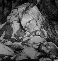
 At first, I thought that Sterling Signature was unsuitable for making
high-key prints. Later I realised I was comparing it directly with papers
with a pure white base - in fact, I like the results
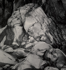
At first, I thought that Sterling Signature was unsuitable for making
high-key prints. Later I realised I was comparing it directly with papers
with a pure white base - in fact, I like the results

The current choice of papers available to the photographer is quite comprehensive, probably better than at any time since I took up photography some 20 years ago. I can just remember some of the well known golden oldies and seem to recall that there were several true warm-toned papers available - IlfordŐs Ilfomar, AgfaŐs Portriga, Kodak Royal Bromesko. When variable contrast papers began to corner the market warm tones became more difficult to achieve until Agfa gave us Multi Contrast Classic and lesser known papers, such as Forte Warmtone, became available from specialist suppliers such as Silverprint.
In recent years Sterling paper has been available in this country and their Premium F Glossy has proved to be a quality product which gives a neutral print colour. A warm toned version has been promised for some time and now it is here. Sterling Signature Premium F VC Warm is a fibre-based glossy paper that it is hoped will be a quality addition to the limited range of true warm toned papers available.
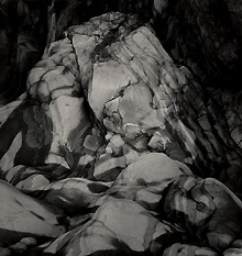
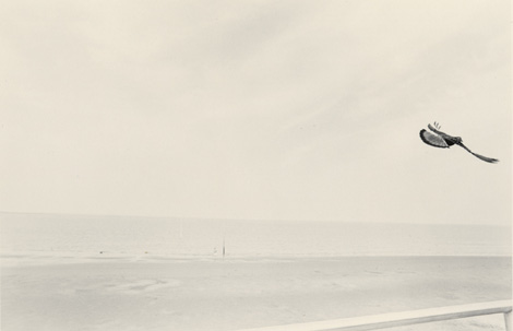
At first, I thought that Sterling Signature was unsuitable for making
high-key prints. Later I realised I was comparing it directly with papers
with a pure white base - in fact, I like the results
Signature is packed in a distinctive black and red box which does catch the eye, but unfortunately is just a fraction too small, and tends to split at the corners with the continual use that boxes get in the darkroom. When the unexposed paper is removed from the black plastic inner bag it does lie very flat on the base board. Signature is similar in weight to most other quality fibre papers available.
When placed in the developer the image appears within 30 seconds and development continues at an even rate until finality is reached. The D-max of Signature is 1.82, less than the D 2.0 or greater achieved by the best neutral toned papers. However, you can not have a warm black without accepting a slightly lower density. After a pre-flash exposure I exposed Signature Warm to an Encapsulite A10 safelight for 12 minutes at two minute intervals and found no trace of safelight fog.
As this is a warm toned paper I used Agfa Multicontrast Classic as a reference point because it is a similar paper. When using Agfa below the lens filters the contrast across the grades is generally similar to Agfa MCC although if Sterling dial in filtration is used the contrast is slightly greater. Ilford filters produced a result that was perhaps 1/2 grade harder. Of the papers that I have tested during the past two years I found that Signature is probably more compatible with Agfa filters than any other. However, when using Agfa filters the exposure had to be increased by a massive 66% because of the density of the filters as against 20% when using Ilford filters.
I have always maintained that manufacturers should provide the end user with the means to get the very best from the paper, which means that they all should produce filters to match every different paper instead of compromising with instructions to use some other filter set (usually Ilford).
As a matter of interest, Sterling make no such recommendation in their literature and I am left wondering what the photographer who does not have a colour enlarger is to do. It is likely that he will have Ilford filters as they are the least expensive and most widely available but are unlikely to give the best result.
Britain has the best filter-making industry in the world - Lee, Simcel FX and others. A set of polyester filters exactly matching the characteristics of any given paper should not be too difficult to specify and have manufactured at a reasonable cost.
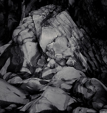
Initially, I made the mistake of comparing it with other paper's base colour for, when held against a print with a white base, Signature looks slightly fogged or stained. However, I don't think that this is a fair way to consider the merits of image colour and feel that we should look at them in isolation. One other consideration is the colour temperature of the viewing light for I found that Signature looked brighter in daylight than when viewed in artificial light.
Perhaps the manufacturers have used a dye in the paper base to help achieve the warm print colour and if so they have succeeded but at what price. I think that some photographers will be influenced by the base colour instead of concentrating on the image colour. Certainly, I have met photographers on my workshops who have been unhappy with anything other than a pure white base colour. I can only suggest that they do as I did and do not decide on first impressions; after all the final print can easily be matted to eliminate the border.
A final word to Sterling about the base colour would be to look at the paper base and if a dye has been used to achieve the warm tone then perhaps a modification to reduce the pink hue would help. Clearly, this is an area in which I have no great expertise but I do know that even the slightest change in any factor could have a significant effect on the end result and therefore it must be a decision that the chemists will have to make.
Signature Warm tones well in both selenium and gold and, as always, I can give no specific times because the final image colour is dependent on tonal range, not to mention personal taste. As a guide, I found that two minutes in selenium diluted 1:6 slightly warmed the print and 6 minutes produced a much warmer result in addition to considerably increasing the contrast.
Gold toning produced a cooler result which was particularly noticeable in a high key print. I also tried different developers and exposure and development times to determine the effect on the final print colour and found that Agfa Neutol WA produced a warmer print with higher contrast than Fotospeed PD5. A 20% increase in exposure together with a 50% decrease in development time produced a warmer result than normal exposure and development.